Location: Antwerp, Belgium
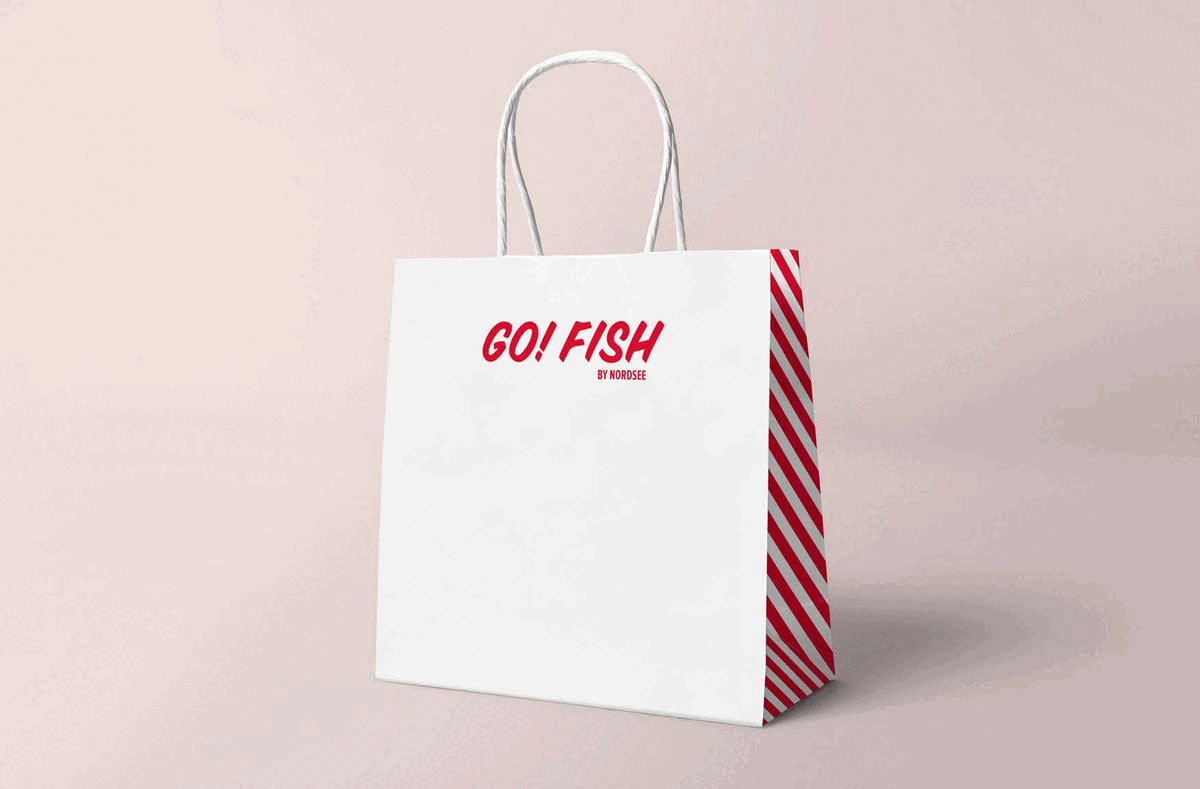
NORDSEE operates over 370 restaurants (franchise partners and company owned stores) in Europe, mostly located in populated areas such as city centers, airports and train stations. NORDSEE’s knowledge about fish has been passed on from generation to generation. Together with the NORDSEE team & Conceptional Aces of Space designed Go!Fish, the rebellious younger sister of NORDSEE.
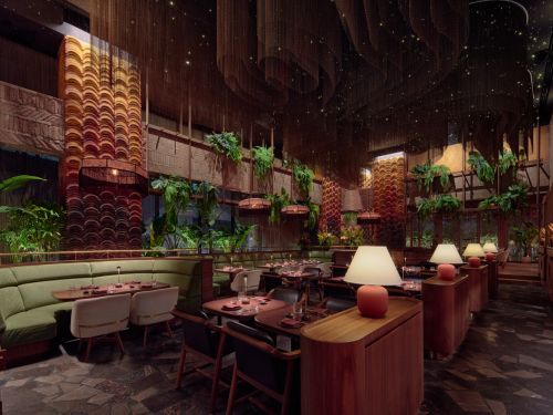
Go!Fish plays into that feeling of adventure and freedom that is characteristic for coastal life. With its humorous tone-of-voice and its accessible and adventurous appearance, Go!Fish connects with younger generations, which is strengthened by it’s nostalgic though modern interior.
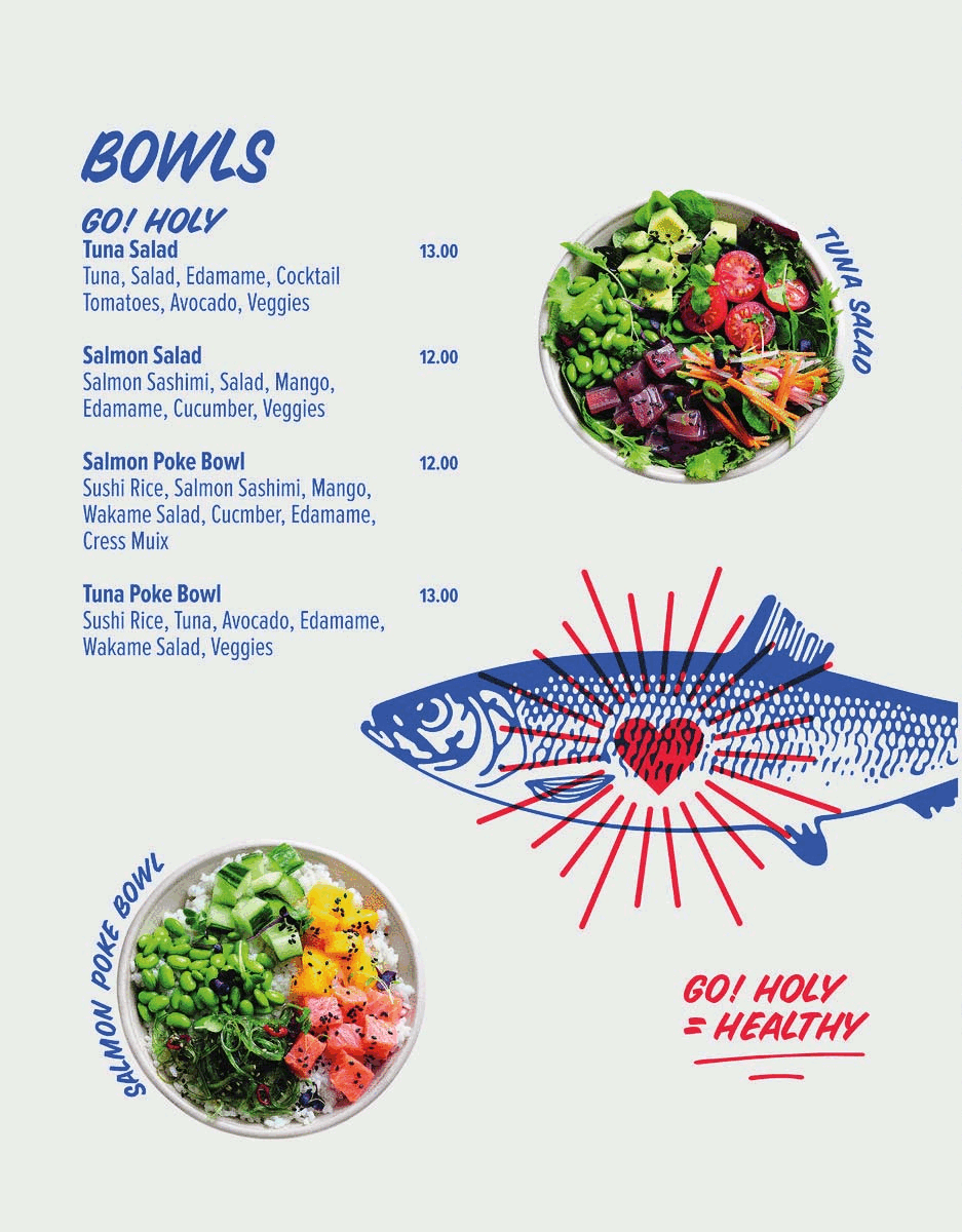
Besides the name and logo, Aces of Space designed all the other branding elements such as uniforms, menu, packaging and graphics. The wavy light feature refers to the ocean and its waves. The brand colours we have used refers to GoFish’s big Brother Nordsee and makes sure there is a connection between the two brands/concepts.
For better web experience, please use the website in portrait mode