
Location: Dubai, UAE
Browns and Co provides a pioneering beauty experience in Dubai. Their team of sought-after therapists and cosmetic artists from around the world personalizes each step of the client journey; championing an ideal of individual beauty that radiates from the inside out. They approached Aces of Space to create and implement a spatial concept & design that would reflect their holistic outlook and facilitate a one-of-a-kind experience that inspires the senses.
THE CONCEPT
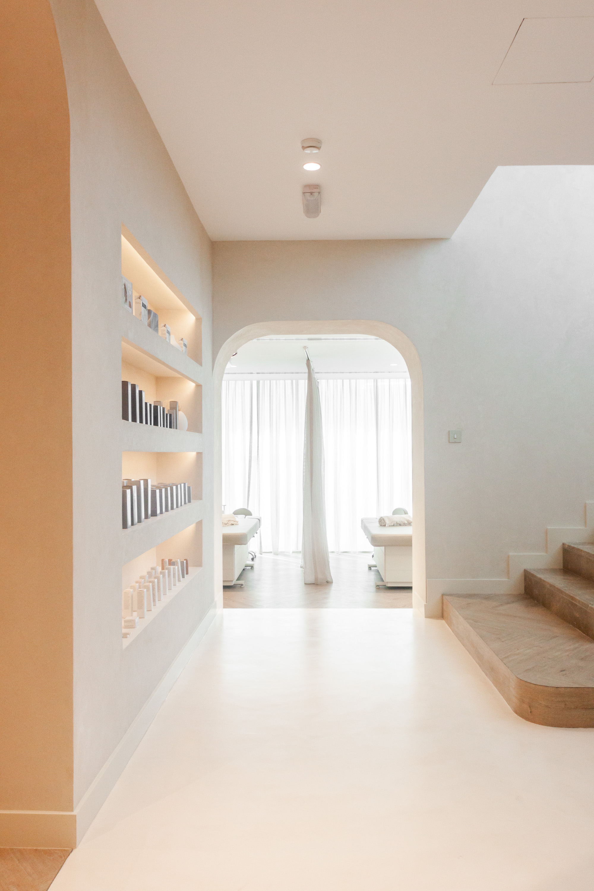
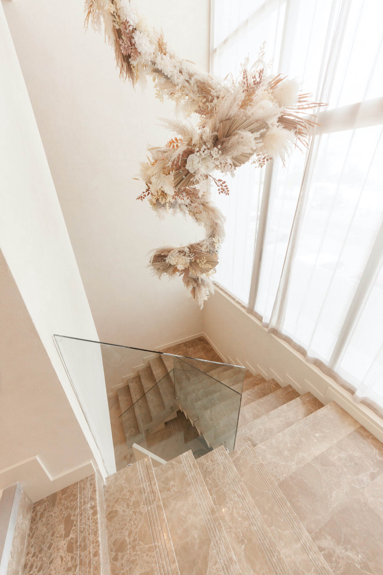
Aces of Space was inspired by the idea of inner beauty radiating from a sense of balance and serenity. This inspiration led them to the concept of ‘balance in design’. It’s about creating focus, eliminating visual noise and distraction so only the essence of the space remains. To heighten the visitor experience of entering an oasis away from the hustle & bustle of the city, the design blended in a thoughtfully curated set of Mediterranean-inspired elements.
THE CHALLENGE
One of the main challenges of this project was to create spaces that match the level of artistic expertise, trust and well-being radiating from the Browns and Co treatments, without drawing too much attention away from the overall experience. The design had to be a soothing background, but never bland. It all comes back to one central idea: balance. In order to achieve that balance, excellence in execution and great attention to detail was required. Every aspect of the concept was scrubbed clean of unnecessary elements and the end result was carefully pieced together to create a casually welcoming holistic effect.
DESIGN DETAILS
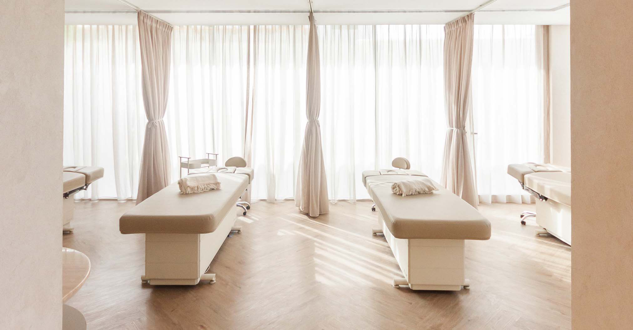
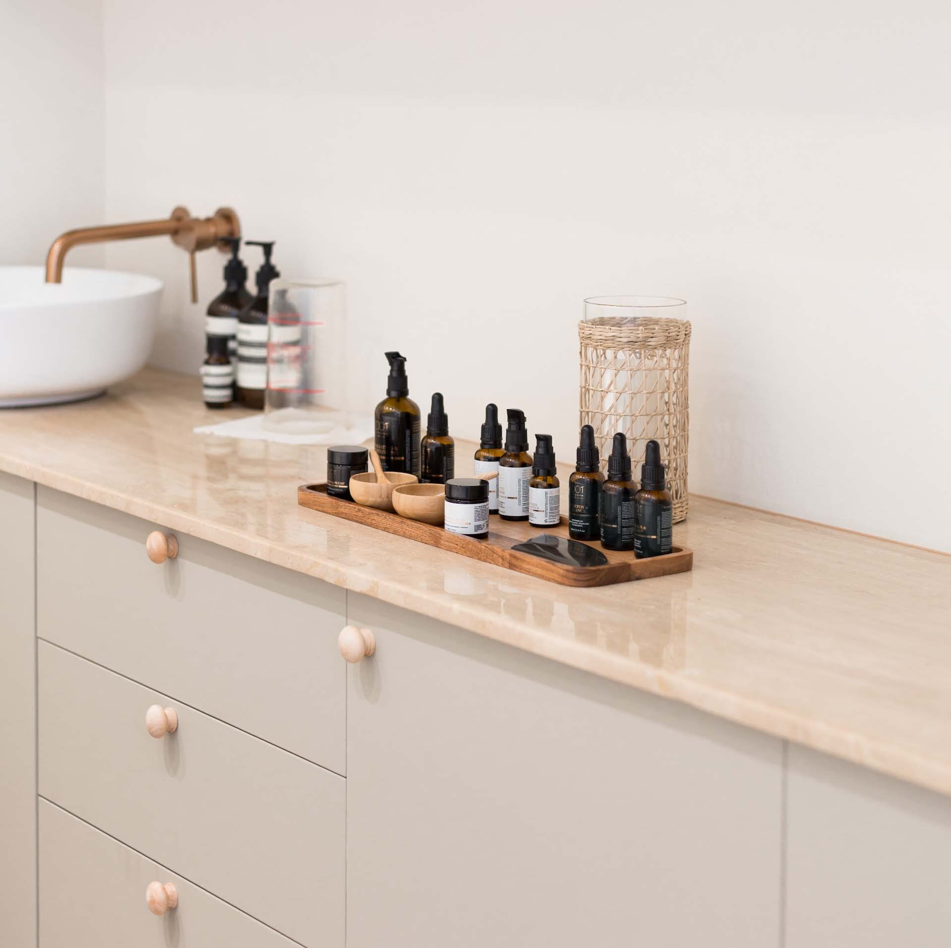
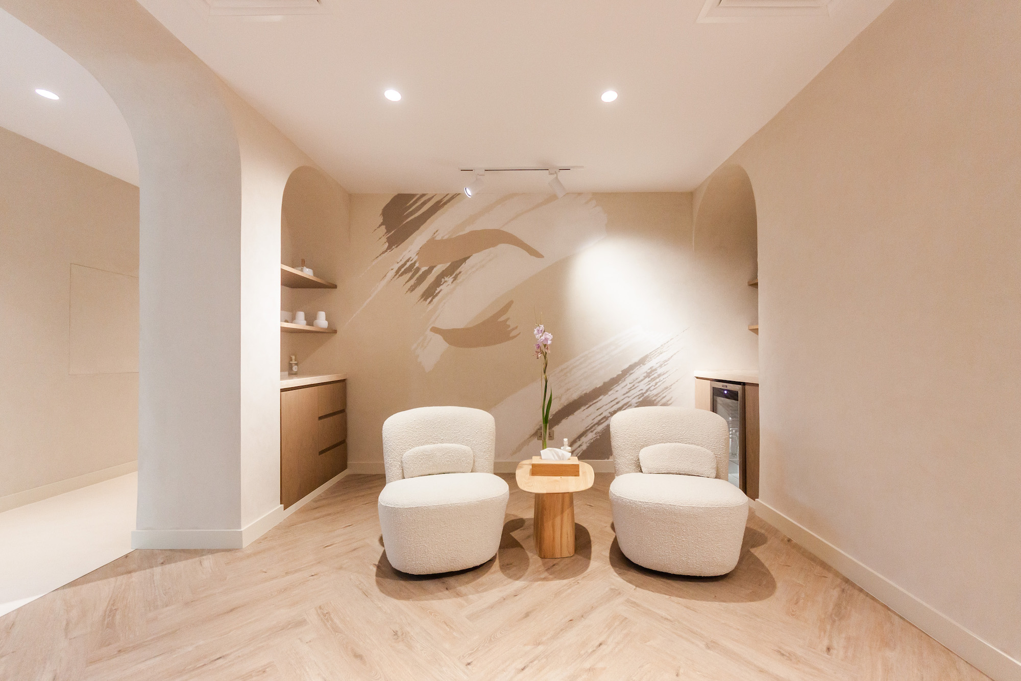
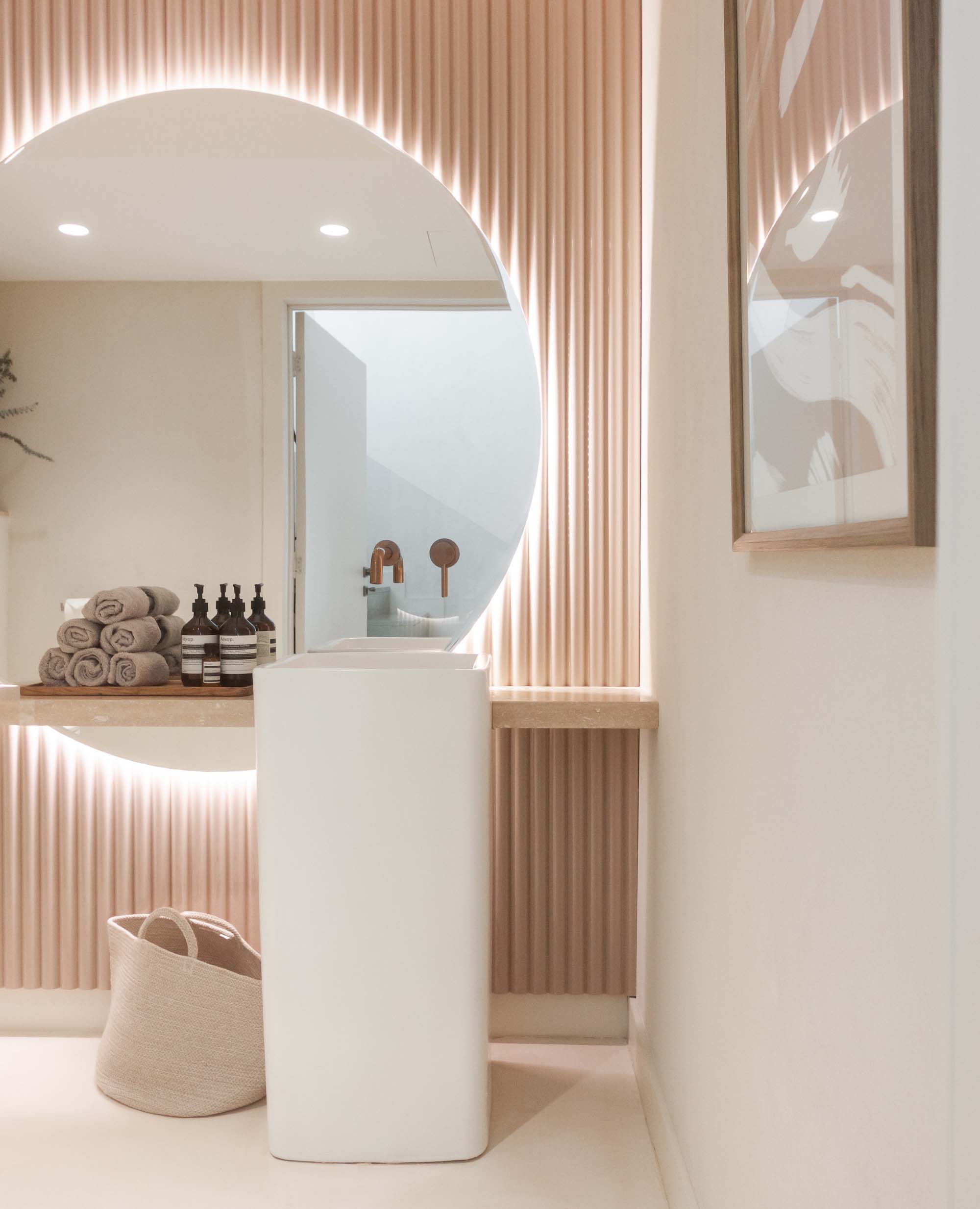
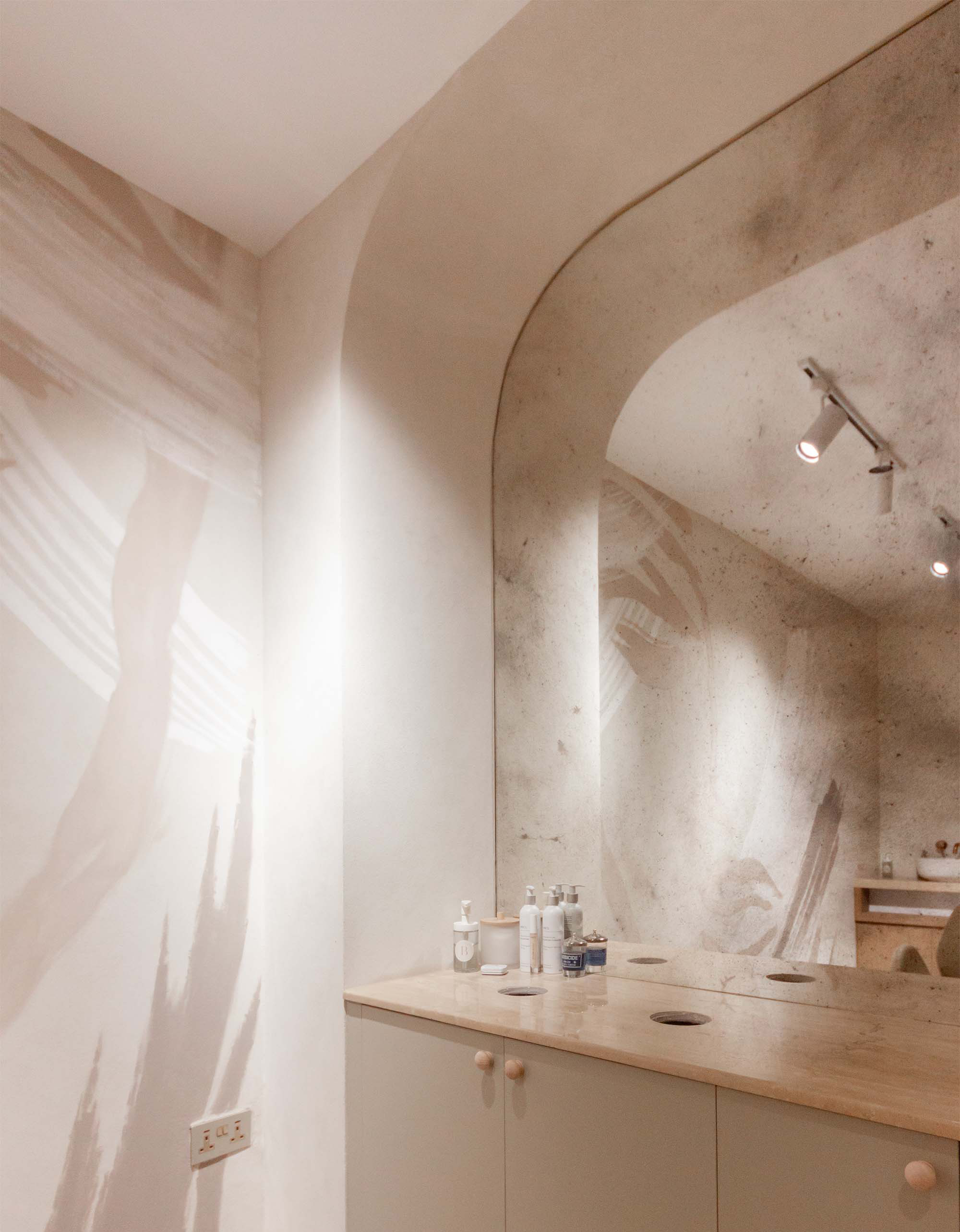
The design considers the visual weight of objects, colors, texture and space to find a serene balance that mirrors the effect of the treatments. In terms of colors, neutral earthy tones compliment the simplicity of the interior and evoke a Balearic, oasis-like atmosphere. The spatial layout allows visitors and staff to flow through the space in an instinctive and effortless way.
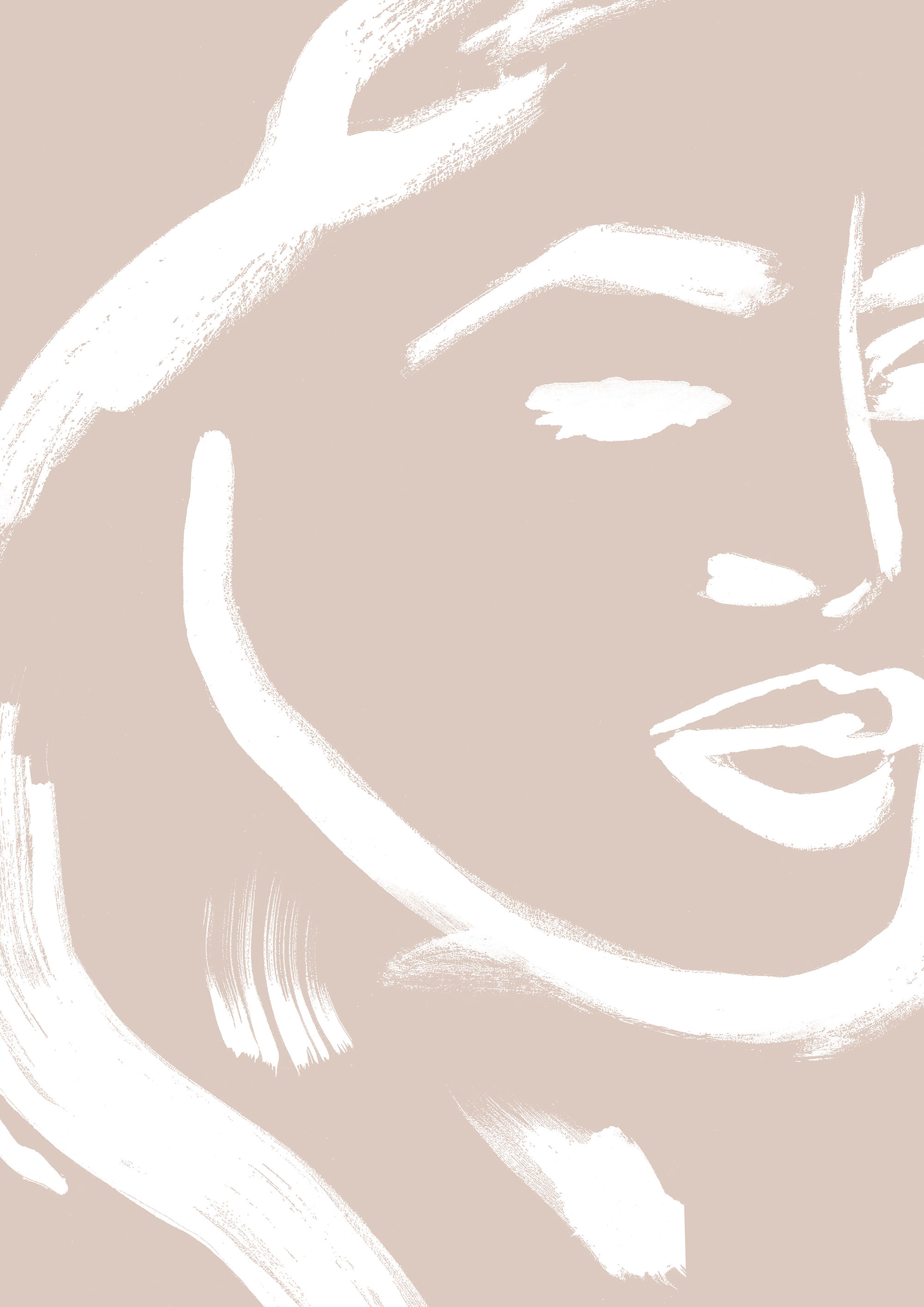
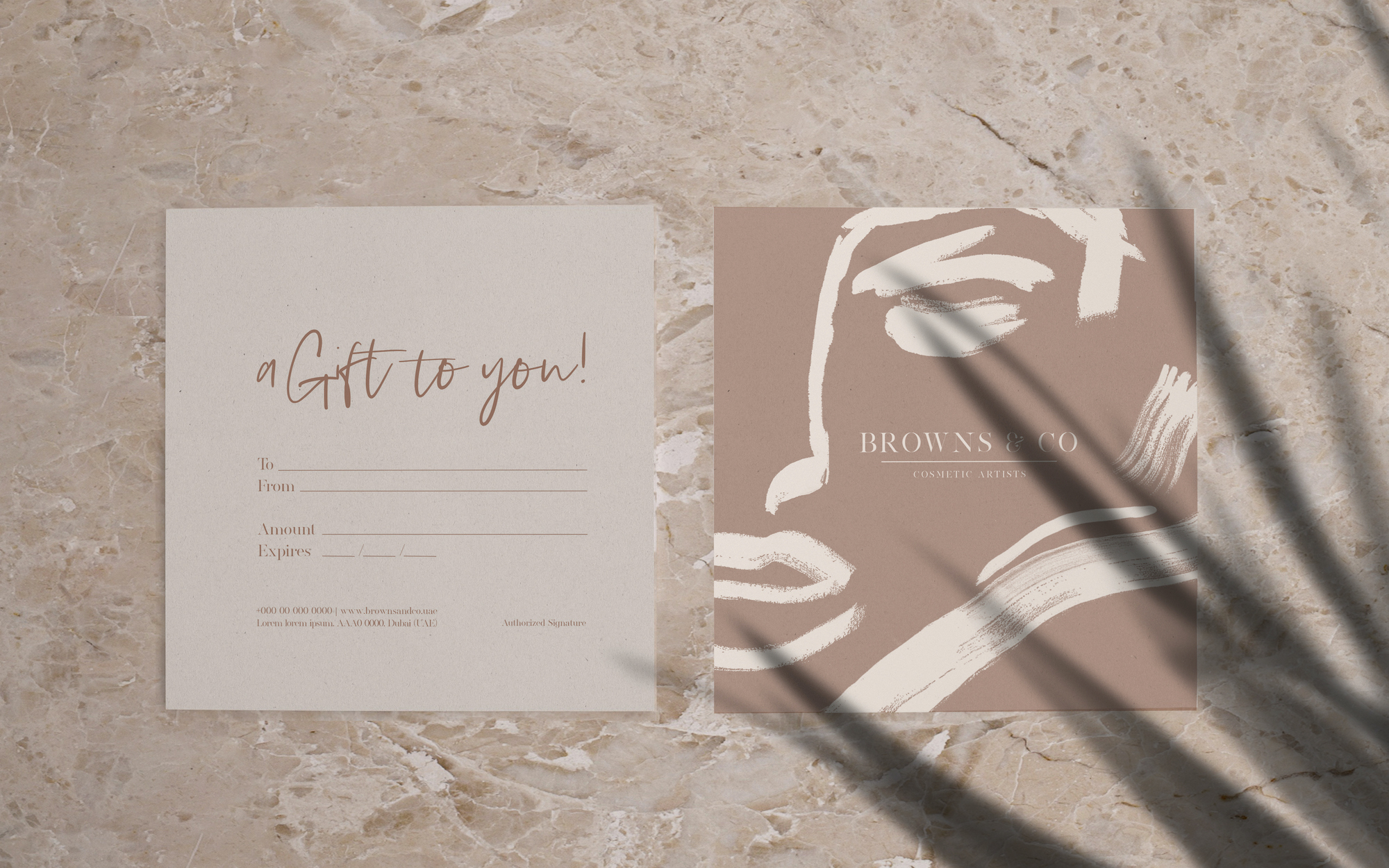
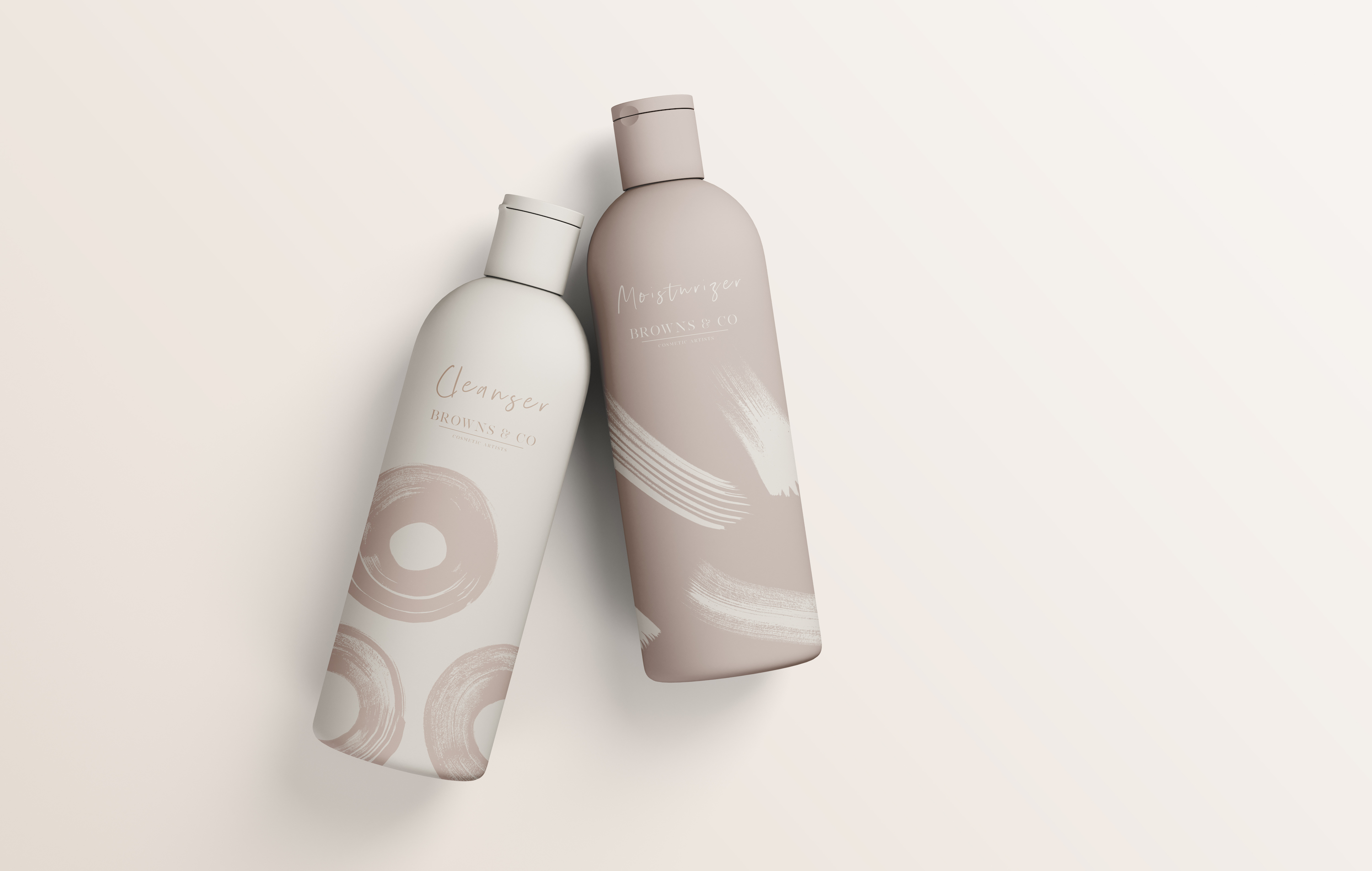
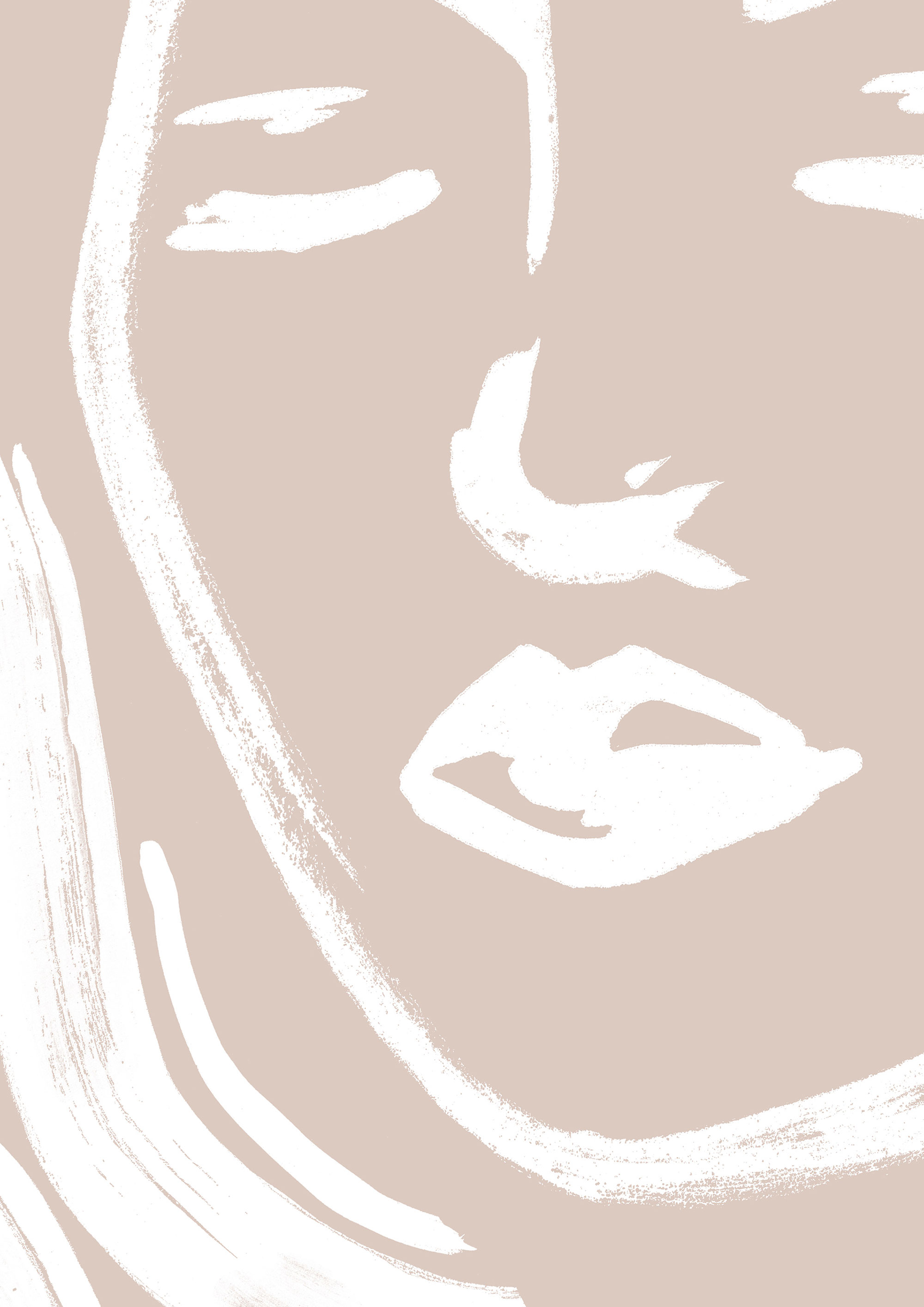
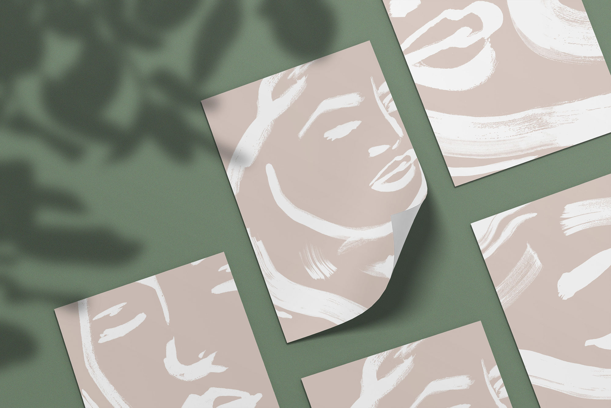
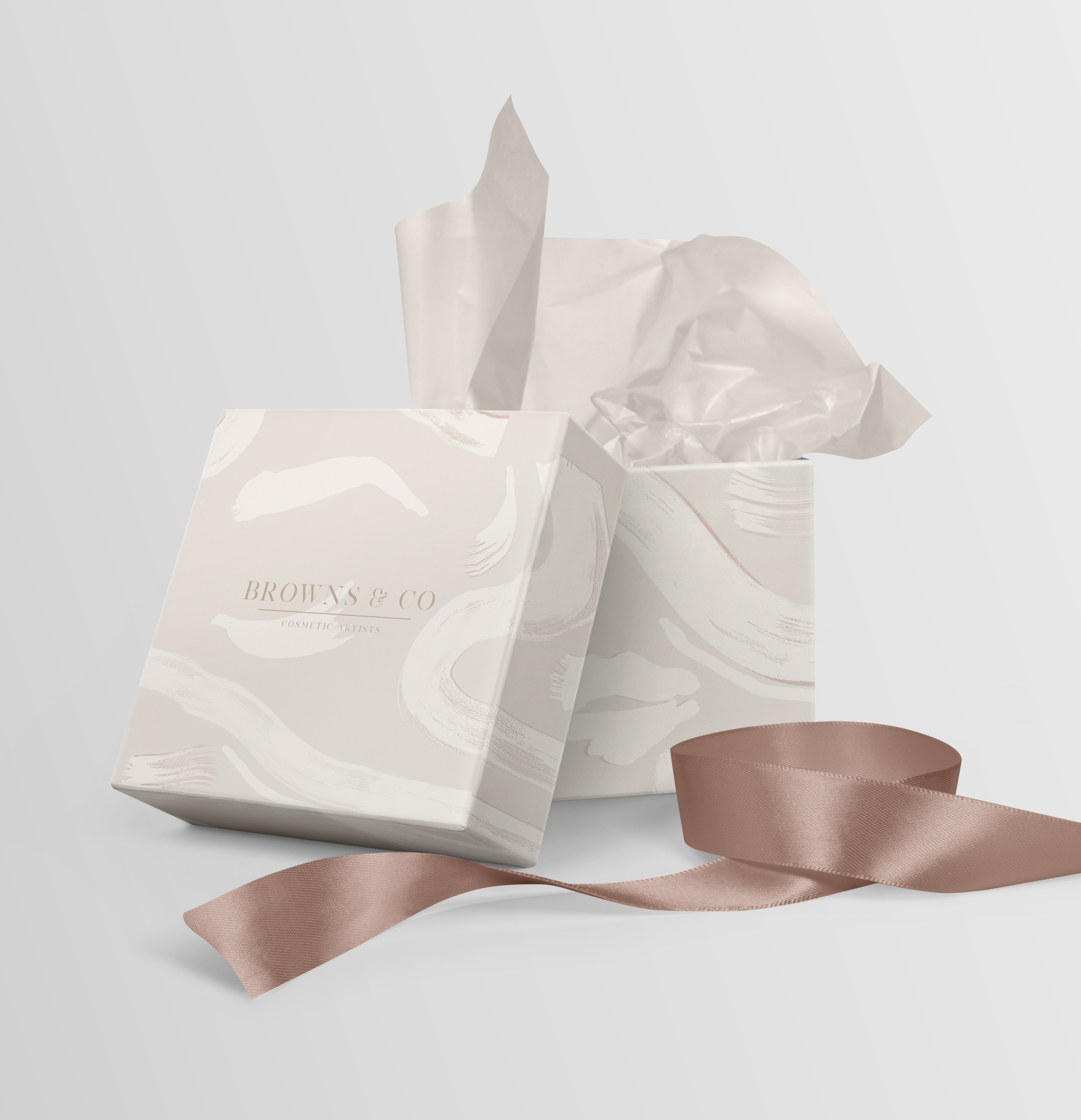
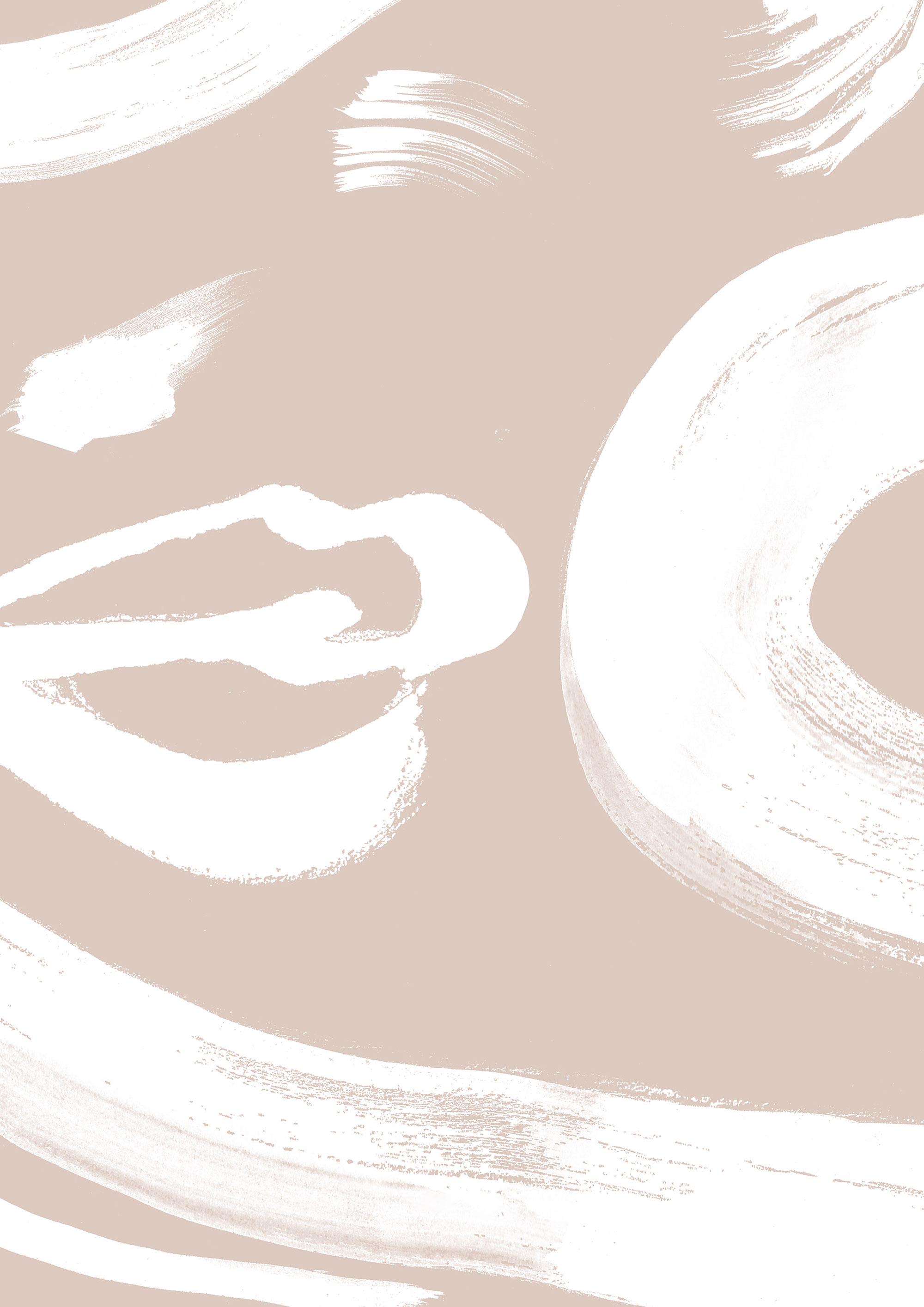
The artistic illustrations are inspired by the essence of the treatments: beauty, tranquility and flow. Because they are hand-made with a brush, they also add a personal and artistic touch to the interior and complement the general sense of ease and flow.
When it came to the specific design of the rooms, the overall holistic effect is deepened by a functional approach, which naturally differentiates the design and layout of each individual space.
For better web experience, please use the website in portrait mode
