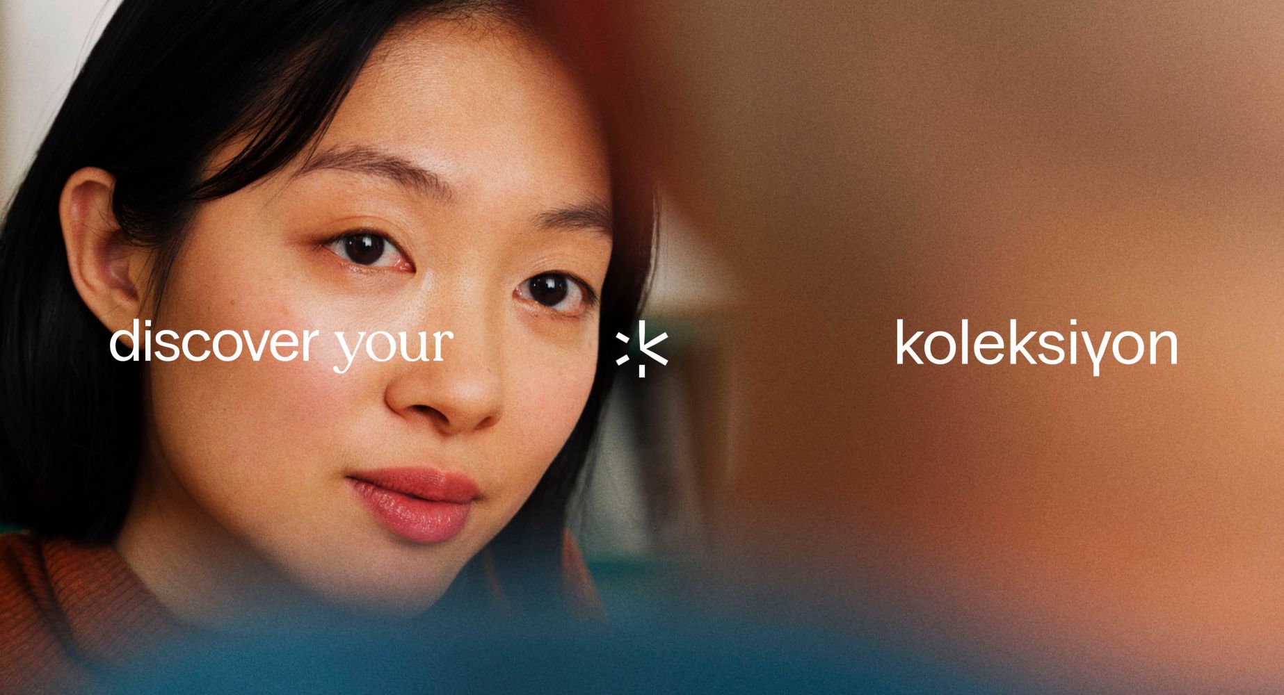
The concept
Our goal is to transform the Koleksiyon brand into one that is more life-centered. We want to place humans at the center of everything we do. Our ambition is to build the brand as a ‘Soft City’ that incorporates all the essential elements of an urban environment. We aim to create an ecosystem in which the product plays a vital role in strengthening all other brand-related components, promoting growth and interaction between them, building a more cohesive and meaningful brand experience for the people involved.
The challenge
For the past 50 years, Koleksiyon has operated and presented itself as a modernistic city, defined by clean, simple, and geometric lines that prioritize functionality over ornamentation. Our challenge was to reposition and rebrand Koleksiyon in a way that not only honors its legacy but also ensures it evolves with the times, remaining forward-thinking and dynamic for the next 50 years, rather than retaining its monolithic character.
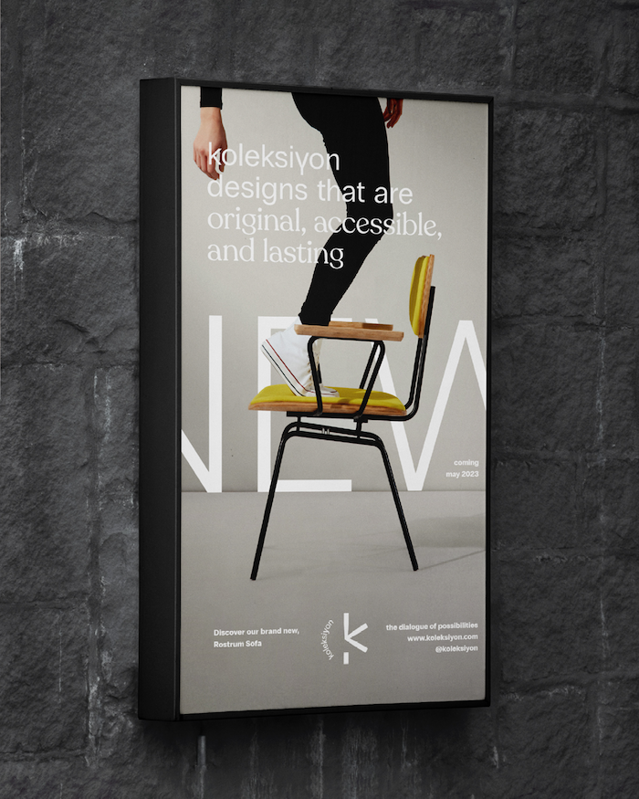
The design
For the branding, a system was developed for the monogram, inspired by architectural angles—where 30° serves as a versatile angle, symbolizing a leg for every hour. More importantly, 30° is the universal angle used in isometric 3D plans, reflecting Koleksiyon’s architectural origins. Complementing this system, a toolkit of playful elements, colors, and typography was created to showcase all facets of the brand, resulting in a cohesive brand image.
For better web experience, please use the website in portrait mode